Monday, December 20, 2010

Peeking Through, 7"x 5"

I recently heard a good instructor say that if you have a building in the focal area of a painting there is not much point in hiding it with trees, etc.

I have thought a lot about that because I happen to like things that are half-way hidden! What I liked about the reference photo was the quiet statement the house made amid so much color.

Wednesday, December 8, 2010

Aflame, 5" x 7" - Sold

This little tree was painted, photographed, and framed last Saturday. I sold 4 paintings that day at the Plowshares craftsfair and thought of replacing them with new ones I had not had the chance to frame for the show. But the muse struck me and this tree practically painted itself.
Sunday was slow going, probably due to the snow, and although this piece did not sell, I received very nice comments about it.

Tuesday, November 30, 2010

Tobihanna Morning, 5" x 7" -Sold

A while back, an artist friend and I took an overnight trip through the Finger Lakes with the sole purpose of taking photo references for future paintings.

This painting is from the the grounds of the B&B where we stayed. The B&B doesn't seem to exist as such anymore but the memory of walking surrounded by fog is still very fresh and brings me peace.

Friday, November 19, 2010

Otisco Sunset , 5"x7" Sold

I've been working on small paintings for the upcoming Plowshares show. This one I'm planning on painting in a larger format for my solo show next year.

Very often I drive around scouting for locations to paint. As it's often the case, the perfect spot is right in the middle of the road, and I'm lucky if I get the chance to take a good photo for reference. I really felt lucky with this one.

Monday, November 8, 2010

Madison Gold, 8" x 16"

Madison is the our neighboring county to the east. This large corn field with Oneida Lake in the background caught my attention.

I had this prepared masonite board a friend had given me and thought it was just the right surface for this painting.

Saturday, October 30, 2010

Last Days of Fall, 8" x 10" - sold

This year I had a ball painting fall scenes.
I used to shy away from yellows, ochers and reds because I did not know how handle those colors, but as with almost anything you try, you gain confidence after a few failures.

Monday, October 25, 2010

A Glorious Autumn Day, 14" x 11"

This Fall has been one of the most beautiful to me. Maybe I'm seeing things in a different way but I know I'll be sad to see the last leaves on the trees being carried away by the wind... Although I have not done any decent plein air this season, I have been painting a few fall scenes from photos and reworking some old ones.

I had started this painting during the Susan Ogilvie workshop back in May, but I had issues with the shadows on the road. This time around I reworked the shape of the shadows and their color, lightened the red of the house, and finally cropped the painting at the bottom. I'm happy with it now.

Monday, October 18, 2010

Autumn Willows, 10" x 20" Sold

This pastel received a Merit Award at last weekend CNY Art Guild Show.

The reference photo is from Ley Creek, in Mattydale. vI took artistic license with the photo by creating a waterway (the foreground was totally covered by tall grasses) and changing the time of day from early afternoon to early evening. Even if the channel looks more like a wet path to you, I do not think it detracts attention from the focal area and the overall mood of the scene.

Friday, October 8, 2010

Meadowbrook in Summer, 9 x 12

This painting was started and practically finished on location one August afternoon. However, back at home I started to have doubts about the dark trees that were originally on the left. After several attempts at reworking the trees while trying different greens, I had to stop and think. At this point I had also looked at other photos taken at this same spot under slightly different light conditions and that confused me even more. Finally, I decided it was best to try and convey a mood, and it was smooth sailing from then on. I hope you get the feeling of a warm and lazy afternoon.

As an afterthought I added three seagulls.

Monday, September 27, 2010

Lavender , 9 X 7

It's a sure thing now, I'll be having a solo show at a popular restaurant next March. Years ago I would had been in a rush to start painting but I'm actually fixing some paintings that I did on location this summer. Somehow it doesn't feel right to start new work when there are paintings begging to be finished. This also gives me time to think what I would like to paint from the tons of reference photos I have, and hopefully a theme will emerge.

This painting is from Lockwood Farm in Skaneateles. By chance, this past spring I learned that there was a lavender farm in the area and without waiting too long I contacted the owner, Karen, who very gracefully invited me to paint at the farm. She also has sheep, and a very friendly barn cat who almost knocked my pastel box when he jump on it! Check out her blog and enjoy the beautiful photographs.

Thursday, September 23, 2010

Jim's Old Place (Payne's Marina), en plein air, 12"x9"

This painting was done during the Old Forge paintout on Sept 3rd.

I had already painted another pastel at a different location but was not satisfied with the results because I had painted it with me under the shade of a building. Once finished, I noticed that the colors were different from what I thought I had when looked under different light. This was the third time this happened to me, so with that in mind I went out to paint another location.

These old buildings in Inlet had called my attention earlier on but at the time they were totally back lit. At 1:30PM I was on the parking lot across the street, in full sunshine with only my hat and sunblock for protection and ready to start. Now that I look at it, I wish I had had more time to tweak it a bit, but at the time it looked fine and I was in a hurry to have it framed for the auction before I left Old Forge.

Thursday, September 9, 2010

The Outhouse at Leetonia, en plein air 10"x10"

For the last 5 years our family has been invited to spend Memorial Day and Labor Day weekends at a friend's camp in Leetonia, in northern PA. For me it's time for relaxation, bird watching and painting.

This is my second attempt at this outhouse. I wanted to include some dead trees but was having such a hard time with them that I had to stop and think whether they were important or not. Since the painting is about the outhouse, I decided to leave them out and I'm happy with the results.

I used watercolor paper prepared with Golden's fine pumice gel and iridescent bright gold. The surface doesn't offer as much tooth as regular sanded papers, but it forces me to be more careful with the pastel application.

Thursday, September 2, 2010

Rainy Day at Old Forge, 9" x 12" SOLD

It's been almost 2 months since my last post, and even though I feel very guilty about it, I have had my reasons. One is that I was fixing a room that now is going to be my framing area. This room used to be my sewing/storage room and there was so much clutter that it took weeks to get rid of most of the stuff. Now it looks beautiful and I'm determined to keep it clean, even after going through a framing spree.

I was invited again to participate at the Old Forge Plein Air Paint Out this weekend. The live auction will be on Sunday, and the proceedings will help finance the last stages of the new Art Center. The painting above will be for sale at the event tomorrow. It was started on location but I had to finish it at home because of the rain.

To all of you who have subscribed to my blog or visit it regularly, thank you!

Monday, June 28, 2010

Mini sunsets , 5x7

Sunset II--SOLD
I did these in preparation for an arts and craft show in a park on the 19th. While this time the event was not a good one in terms of sales, I had a good time meeting people and talking with a few who showed interest in the medium.

In Sunset II I was figuring out how far I could push some colors but still keeping the idea of the end of the day.

Sunset on the Moose
Sunset on the Moose was more of a search into color combination that started with the sky colors.

Sunset on Seneca Lake--SOLD

Sunset on Seneca Lake was a study for a future version. The sailboat is the Mallabar X coming to shore.

All were done on Ampersand Pastelbord.

Tuesday, June 8, 2010

5:00PM at Leetonia, en plein air, 12" x 9"

Memorial Day weekend was spend at Leetonia, PA, with family and friends.

While my husband was setting out the tent, I was setting out my easel-- My excuse: when the light is just right you cannot afford to waste time with unimportant things.

Because of the late frost we had earlier in some areas of the NE, I noticed lots of dead foliage on trees at higher elevations along the way. This was even more apparent at Leetonia (near the Great Canyon of the East, in north central PA).
I had the eerie feeling of painting fall and spring at the same time. The dead foliage had turned a rusty color that glowed orange in the sun, and the new foliage was fresh spring green. A very strange contrast indeed.

Monday, May 24, 2010

Robert Carsten Workshop

I've heard that one should take time to put in practice what one has learned from one workshop before taking another. That makes sense, but when a good opportunity comes one's way, one just have to take it, so that's why I ended up taking the Robert Carsten 2-days workshop 2 weeks after the one with Susan Ogilvie.
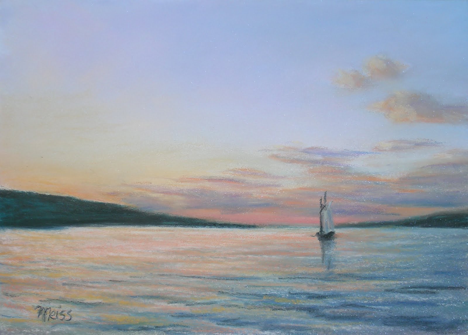
Painting#1
Carsten was invited to Syracuse by the Everson Museum, and because a friend had said so many wonderful things about him and the tidbits of info he gives here and there, I decided to take it. Good move! He is a wonderful teacher, who made the lessons fun and relaxing, at the same time that he encouraged us to do several paintings.

Painting #2
I learned so many little things that are very important in producing good work, one of them, not to give up so easily when the painting is not working the way you want it, as was the case with painting #3, where the season went form spring to summer,

Painting #3
and an opening was added on the left bank switching the area of interest from the water on the foreground to the opening, and making the painting more interesting.

Painting #4
I wanted to get ideas for painting different weather conditions and we had 30 minutes left before a general discussion session. So, my snow scene was done in a record time of 20 minutes! The pressure made me decide quickly what to leave out.

I'm very happy I took this workshop as it also gave me chance to get to know other local artists I see only on occasions.

Sunday, May 16, 2010

Ogilvie Workshop, Days 4 and 5

Day 4 started with a discussion on color. Susan suggests to consider value first, then color/color temperature and then, increase or decrease its intensity. The goal is to make a logical approach to color selection instead of simply guessing. She started a demo using an acrylic underpainting. I didn't have gatorboards left, nor had any fluid acrylics in the primary colors so I just observed and took detailed notes so I can use the technique some other time.

Painting #6
I started my painting #6, which was finished the next day. It might not be a very interesting or appealing painting but I learned some very important things about color and how I work from this piece. One is that I need to be more daring with color. Originally the mountain in the distance was a paler blue. At Susan's suggestion the color was intensified but it still reads as a cool, cloudy day. The same happened with the sky. Instead of lavenders, some peaches and pinks were added which had the effect of warming up the scene just a little bit without changing the overall feeling of an overcast day. I also became aware that I tend to add whites or very light colors when I need to warm up an area. Susan selected some warm browns for me to demonstrate how to warm up the dirt in the foreground.

Day 5 was business talk in the morning. One important thing Susan mentioned is that 50% of art time is really business. This is something to think about...
She continued with the pastel application on the acrylic underpainting. The key is to simplify, develop value slowly, and unify with color. She stresses not to use white. The only reason she carries it in her box is to demonstrate how glaring a streak of while looks on a painting that has a wide range of values and reads well. We continued with our own work and she did several rounds of critique. All of a sudden, it was time to pack and go home.

I feel enriched by this workshop, and also very energized. Now I'm figuring out what to do next.

Going with friends made the trip even more enjoyable as 4 of us from the area decided to lodge at the same place and were able to prepare breakfasts and dinners together, and play cards at night. It was "me" time I really needed.

Friday, May 14, 2010

Ogilvie Workshop, continued-Day 3

While there, Susan was to be the juror of awards to the 6th National NE Pastel Competition so she saw it as a great opportunity for us to learn about her thought process in selecting work. She only commented on the top awards, but it was very interesting and informative. That morning she did a PowerPoint presentation of several of her works from sketch to finished painting which was helpful in making us aware of the steps she takes when something isn't quite there, and how she solves the problem.
Painting #4
In the afternoon we went to see her painting on location. She did a quick sketch and started a demo. Her demos were never finished in one go, but they were helpful because it was like seeing how her mind worked when deciding what color to use and what areas needed to be tackled first. I asked her why she had chosen a scene that didn't seem to have that much appeal compared to what was around and she said that sometimes she simply likes to challenge herself and she learns the most form those pieces.
I decided right there that I was going to do the same, because after all, what was the point of taking a workshop if I wasn't going to push myself to some degree? A falling bank with some dead trees peeking out of the water was my afternoon project.
Painting #4, reworked

I'm showing here my first attempt (top one) and the reworked version, after some good critique from Susan. I needed to define some of the trees, the horizon line was almost at the center (that was more obvious when the board was placed on the side) and I needed an element on the left side to keep the eye from wandering out of the painting.
At the end of the workshop, she said that was my strongest piece, and I'm happy to say that I felt the same way too.

Painting #5

That day I also painted this fall scene. The shadows on the foreground were made up and perhaps that's why I do not like them. I'm debating on taking the easy way out and crop it, or rework those shadows...

Wednesday, May 12, 2010

Ogilvie Workshop, continued-Day 2

On Day 2, Susan did a sketch demo on location, at a beautiful area of the Moose River. She uses the Golden Mean to place the areas of interest. Important points are : Get the parts that appeal to you. Simplify. Use abstract shapes to compose. Make color notes.
Painting #2
Her idea of making the sketch work for you, was a revelation to me. I have often taken artist license when painting certain scenes, but what she said had more implications and possibilities, and made me realize why sometimes I end up with paintings that do not work. This is more difficult to grasp when you are painting outdoors and feel you are cheating if you make major changes to the scene.
I did two sketches that morning and would have liked to do a third one but it started to rain. It was lunch- time anyway. In the afternoon I worked solely from my second sketch.

Susan wanted us to paint water reflections and at least one structure/building. I had 2 paintings with water reflections, now I needed one with a building.
Painting #3
For a while I've been thinking of a photo of a barn I liked, but didn't know how to change the composition. I knew what particular things I wanted to include but didn't know how to put it together. Susan suggested to place a tree behind the barn. I did a sketch using that idea and it worked! She also suggested that I include the pole to give a sense of scale.

Reference for painting #3
I'm showing the reference photo just to give you an idea of how much you can change something and make it work for you.
I think the specs of reddish underpainting add a lot to both paintings and I'm planning to use it for other supports.

Tuesday, May 11, 2010

Workshop with Susan Ogilvie-Day 1

I recently came back from a wonderful 5-day workshop with Susan Ogilvie, at the Old Forge Arts Center.
Three great pastellist were coming to the area this year (Ogilvie, Handell, Dawson) and it was tough deciding which one to take. I chose the Ogilvie one because of comments I read by some Wet Canvas members and blogger Katherine van Schoonhoven. The idea of exploring color and getting out of my comfort zone was very appealing to me.

It's the best workshop I've taken so far. It was challenging and now I feel so empowered by it.
From the beginning Susan encouraged us to do 2 painting/day. I was able to do only 6, including a major change I did to one of them. My only regret is not having done a winter scene while there as I would have loved to hear he comments on painting snow. The people from the Old Forge Arts Center were very helpful and accommodating, allowing us to stay two more hours after the workshop was over for the day.
Painting#1
Day 1
Susan did a demo on Gatorboard preparation. You do that by tinting the board first and then applying a mix of pumice gel and dry pumice powder. Working on this surface was challenging at first. I'm glad I did my first try on a 10"x 8" board. By the time I painted the second piece, I had gotten resigned to working on that texture. When #3 and #4, were painted, I was enjoying it so much that I ended up applying it to an Ampersand board. If you are the kind of person who has trouble letting the color of the support or underpainting show, this might be a good thing to try, as it's really hard to completely cover it (of course, this depends on how thick you apply the pumice paste). One of the things Susan stresses is doing a good sketch and working from it, and simplification is one of the keys. She started a pastel demo working from her sketch. If something doesn't work, change the shape, change the value, or change the color. We painted from photos and sketches.

Sunday, May 2, 2010

Getting ready

The art sale a week ago went very well. I sold 7 paintings in 2 days! Some were bought by returned customers. Anne is the new owner of the two pieces shown here A Cloudy Day and Meadow in Fog--thank you Ann!

Some artists do not paint scenes that appeal to them simply because they think the subject won't sell. What sells should never be the main factor in determining what to paint. Not everyone goes for the colorful, bright, "happy" paintings. Personally, I love foggy and cloudy days because I find them very comforting. They bring very good memories of field trips to cloud forests in Costa Rica, and they often invite introspection.

Follow your muse. Sooner or later you're likely to find kindred souls who will appreciate your work.

Tuesday, April 20, 2010

Bouquet, 9 1/2 x 7 1/2

I feel so bad for not having been updating my blog. April and May are the busiest times of the year for me with so many shows to apply to, prepare for and submit artwork to, and on top of that, framing, working, and trying to get some plein air done when the weather is nice... you get the picture.

I did this painting over a month ago. It was the third one that day, and surprisingly, it worked.
Canson is the simplest of papers there is to work in pastels, and although it was the only paper I used when I started in pastels 10 years ago, nowadays I rarely do so. Being used to working on sanded surfaces, switching to Canson requires a much softer touch and more planing, as it cannot take many layers.

This piece will be for sale at the Onondaga Art Guild Spring Sale on April 24th (10-4) and April 25th (noon-5). If you live in the area, I hope to see you there!

Thursday, March 25, 2010

First Plein Air of the Year

Green Lakes in Spring, 9"x12"
A friend recently got a new easel and she wanted to try it outdoors so she suggested we go painting somewhere. I don't think we could have chosen a better place than Green Lakes State Park.

I have painted there before and I'm always fascinated by how fast the water changes on a breeze day. In the hour and a half we stood at the spot I figured I could have painted that scene in at least ten different ways.

Saturday, March 20, 2010

On the Way to Cross Lake, 9"x9

I had the intention to try painting outdoors this past winter, but never got around to it. As a matter of fact, I didn't even paint a single winter scene.

Somehow it didn't feel right to let the season go without a reminder of it, so I had to console myself myself by painting from a photo.

This is a late February scene of one of the many roads that lead to Cross Lake (snow-covered in the distance). I find the yellow of the willows very uplifting during that time of year. I used black Canson paper.

Wednesday, March 10, 2010

Two from One

Sunset by the Pond, 9" x 12" SOLD
I'm planning on taking a workshop with Susan Ogilvie in a few months, and because her style and use of color is so different from mine, I decided to challenge myself color-wise. A blurry photo of a farm pond on Rt 13 near Dryden gave me that opportunity and more. Top one was the first version. I wanted a sunset, so I started with the pink flamingo sky.
Fall Reflections, 8" x 10"

I do not remember the reason behind the second version, but perhaps it was the water and the reflections. Although it's not so wild in color, it gave me the chance to explore color harmonies.
All in all it was a fun exercise, and what I liked the most was playing with the distance and changing shapes.

Thursday, February 25, 2010

A Bright November Afternoon, 9" x 12"

When I'm in the mood to paint but do not know exactly what, I take the time and look at my digital photos. I try to name photo folders with titles that can help me find what I'm looking for. Two examples are Just for Inspiration, and Must Paint. The photo for this painting wasn't in either of them. I've studied it before and then have moved to another photo. Last time I looked at it though, it really spoke to me, as if I was seeing it for the first time. I started it right away and it turned out to be a smooth going from beginning to end.

The place is somewhere on Rt 218 before reaching Rt11 N, in the heart of Central New York farmland.

Friday, February 12, 2010

Suggested Landscapes


These two paintings came about by chance. I had this failed painting I had reworked so much that the tooth of the paper was almost gone in some areas. I decided to cut the sheet into four pieces and apply some pumice gel with acrylic paint to restore the tooth.
Because the stain I used was so thin, two of the pieces showed a ghost of a landscape (see pics below), so, with some apprehension, I let my imagination run wild. For me, this means taking great chances because all previous paintings that came out from my head had been real flops. To my surprise, this time I ended up with two small studies in which I had incorporated things learned from direct observation or from other paintings. It's amazing how little successes like these have the power to erase our failures and prepare us to take more chances with our painting.

Sunday, February 7, 2010

Padgett Workshop-Last Day

How I wish this workshop had continued for at least two more weeks! I think the reason I have enjoyed it so much is because I have felt very relaxed, with no pressure to produce great pieces.

This time I did more than simple studies. The top one was the last of the two I painted, but it was the more successful. Perhaps that was due to several things: I had a little more than half an hour to work on it before the final critique, and I used a very bumpy watercolor paper, covered with micaceous iron oxide--I was very apprehensive at first, but very soon I realized that the bumpiness kept me from giving too much detail to the daisies.

For the calla lilies I used Colourfix paper brought back to life with yellow green acrylic paint and fine pumice gel.

Sunday, January 31, 2010

More Floral Studies

I'm having a ball! The workshop I'm taking has energized me so much and has given me the chance to take some time off from two other large pieces that are taking much longer than I thought to finish. I have also been having fun preparing my own pastel surfaces with the colors I like.

The tulips were my first study from yesterday's workshop. I purposely used the busy fabric because the colors reflected those of the tulips and the vase, but also because I wanted to force myself not to give much detail to the background.

After the tulips, the daffodils seemed like a piece of cake but those flowers are difficult to paint if one starts with the brightest yellow. I had to tone them down by adding pale greens and lavender to the shaded areas.

Sunday, January 24, 2010

Small Floral Studies

I'm taking a 3-Saturday floral workshop with Mary Padgett, a local artists who paints gorgeous flowers. While I have taken two other workshops with her before, this time around I wanted to concentrate on mark making and color.

One of the things we covered in the first class was the importance of the paper color to better enhance the subject. To that end we prepared several sheets of watercolor paper using Golden's Acrylic Ground for Pastels, mixed with acrylics or Micaceous Iron Oxide (this one produces a shiny, dark gray surface with great tooth). While the prepared paper was drying, I had time for two small studies, both done on Uart paper. The first one (top), was well thought, and I purposely didn't do any blending with my fingers. The second one (lilies) was more for the purpose of handling complementary colors, and it was done in a hurry.


Today, I painted two more, using two of the papers I prepared: orange for the sunflower, and yellow-orange for the daisies. Each was done in about half an hour. More time than that and I would have started blending. For next class, we were promised some spring flowers...

Monday, January 18, 2010

Sidewalk Garden, 8"x 10"


I think I'm finally done with this painting. It had been sitting on a small easel in my studio, and while I was taking a break from a larger painting, I decided to finish it. A small bush by the focal area needed to go; then, a few tweaks here and there, and that was it.

It was a very challenging piece since I wanted to represent midday conditions, with light reflecting from different angles. This meant using different colors from the ones I'm used to, and because it was also a busy scene, I had to be careful and not give too much detail to the foreground.